Vinsyt / Design system
One platform, four surfaces
A shared design system for owner apps and dealership communications.
Role
Design-system structure, theme rules, tokens, and components.
Shared platform
Start with what the four areas share
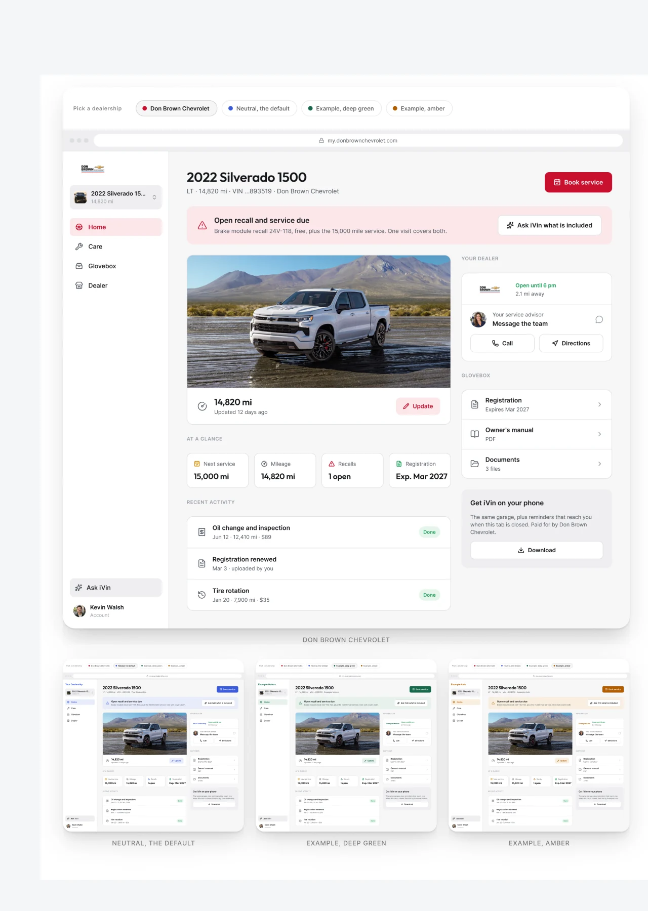
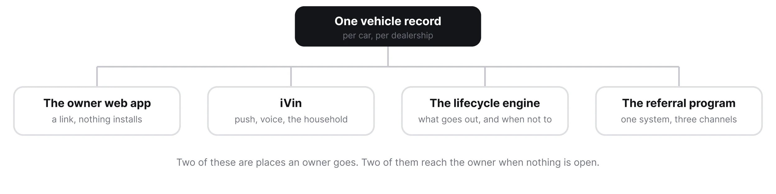
The overview connects the owner experiences and the messaging programs to the same vehicle record. The system connects how they are presented: consistent components, type, spacing, and status treatments, with room for the dealership’s brand.
Vinsyt is the software a dealership runs its aftercare on: the vehicle record, the schedule, the visits, and the messages that go out between them. Every surface reads the same record and wears the same dealership’s name.
One record, four connected areas
Two owner experiences and two messaging programs share the platform and its design foundations.
Dealership themes
Change the brand, not the component
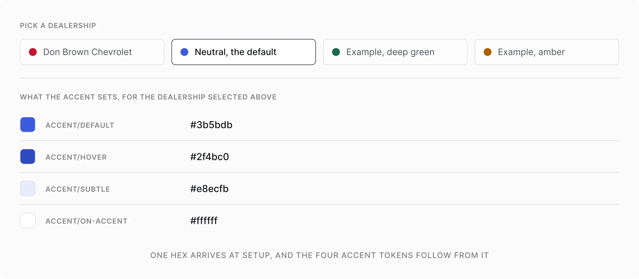
The theme comparison holds the vehicle page constant while the dealership accent changes. Buttons, selected states, and highlights draw from the theme rather than being redesigned for each brand.
Color, logo and name enter at one place, and every accent surface reads them from a single token, which makes a new dealership a configuration rather than a design job.
Dealership theme inputs
Dealership identity is configured through shared theme inputs.
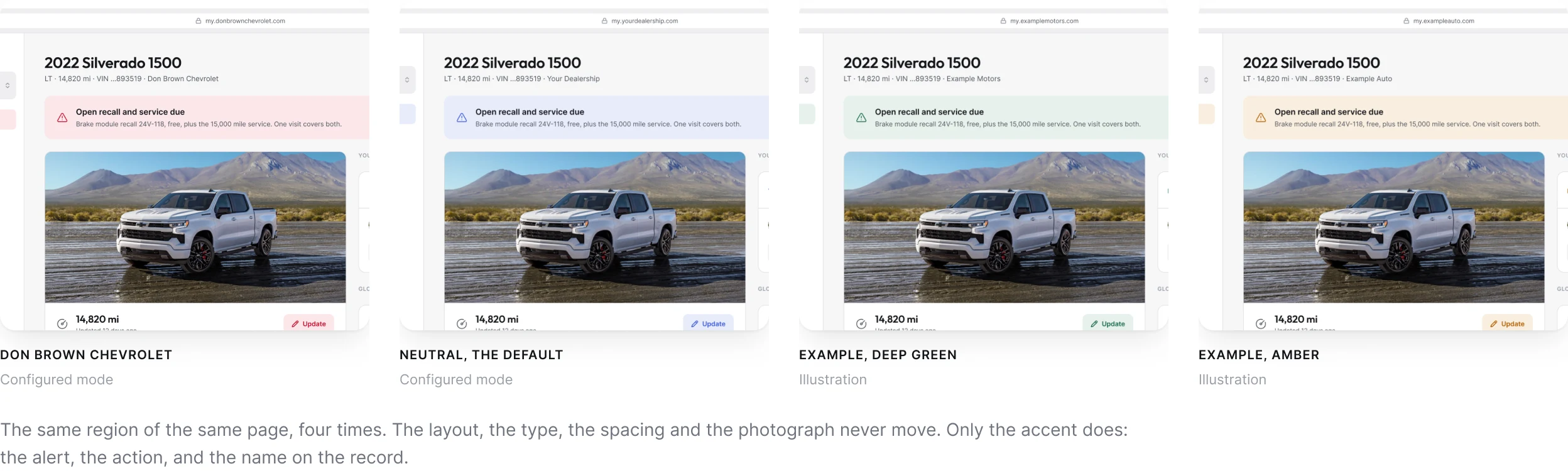
The same screen, four dealerships
Two of these are configured modes in the Figma file. The other two are illustrations, to show that the system does not care which color arrives.
Rules for variation
Keep brand color separate from meaning
A dealership can bring a red, a green, or a yellow accent. That color cannot also carry every status meaning in the interface.
I kept urgency in consistent status treatments, made button colors account for contrast against their labels, and kept the assistant’s cyan separate from the dealership theme.
Urgency, contrast, and assistant identity
Theme variation is constrained by status, contrast, and assistant-identity rules.
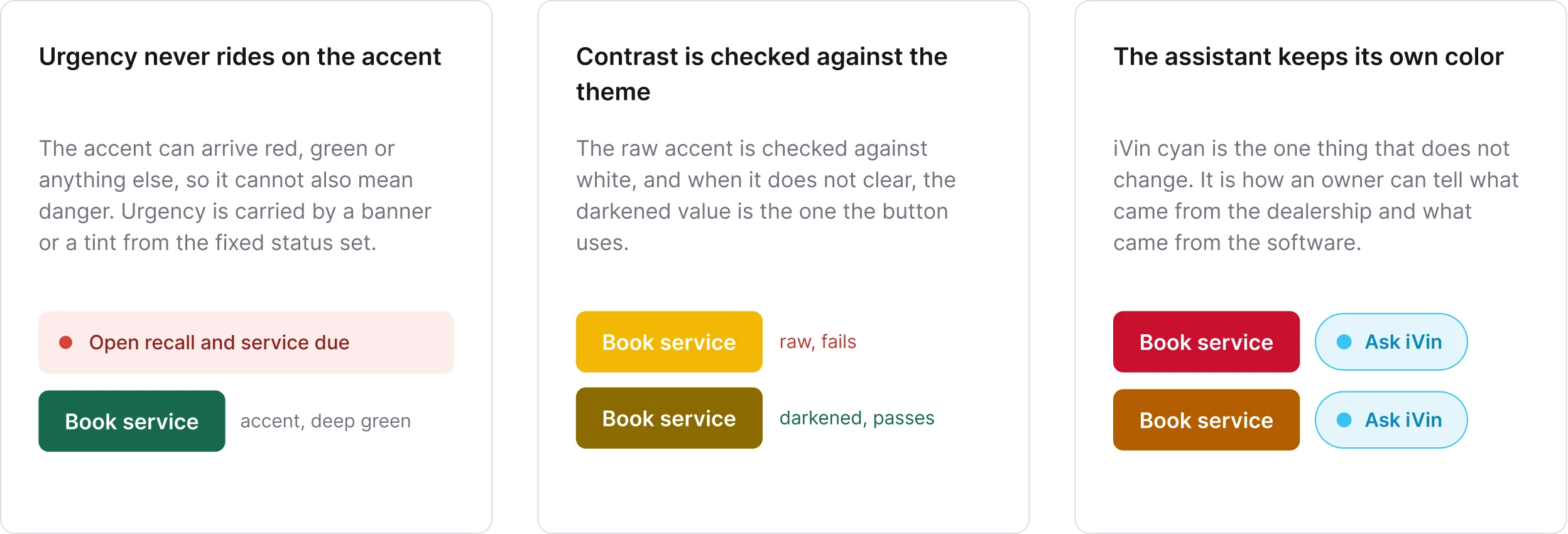
The one mark that is not the dealer’s
Everything else on the screen takes the dealership’s name and color. The assistant keeps its own, because it is the one thing the owner installs under its own name.

Shared foundations
Fix the foundations that should not vary
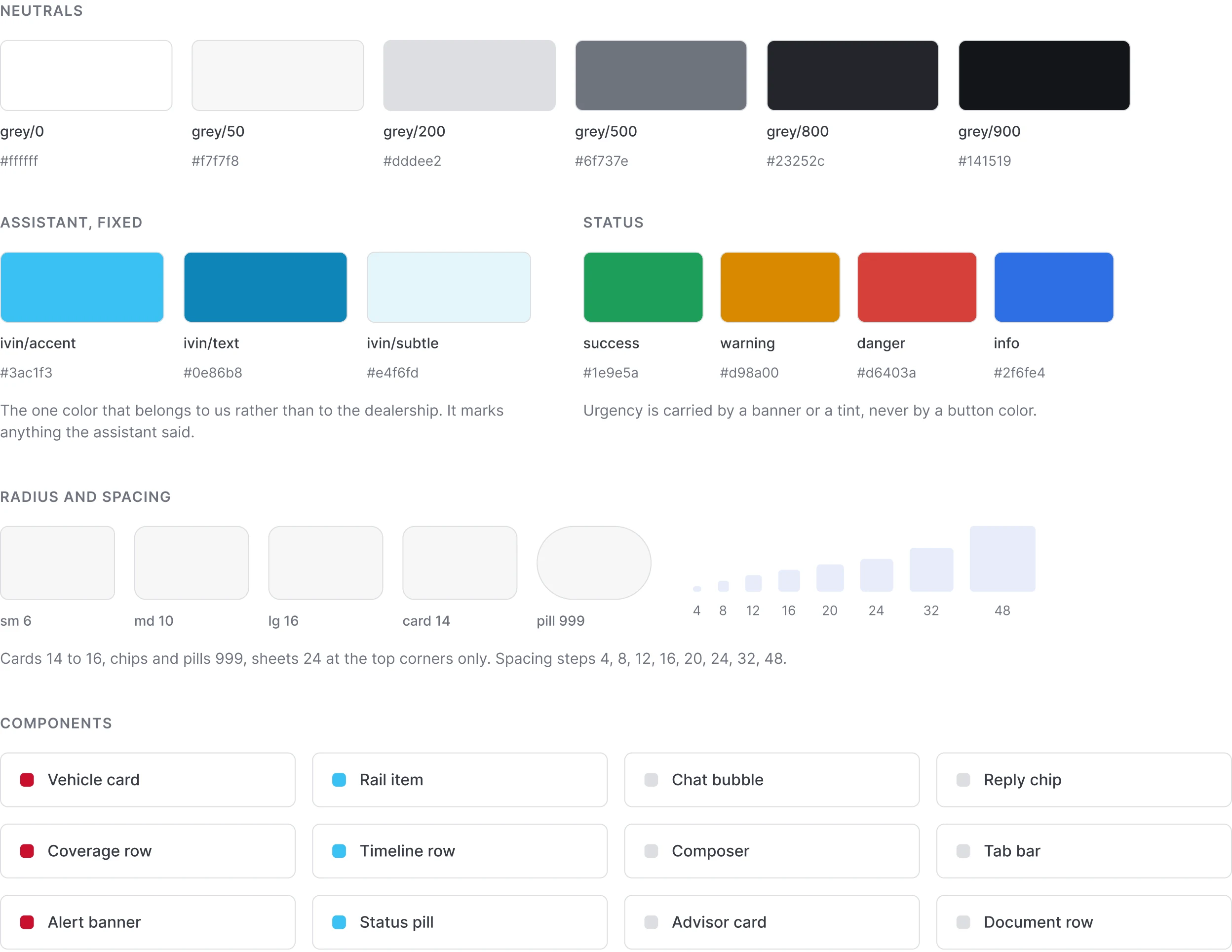
Typography, neutrals, status colors, spacing, and radii remain shared. The component inventory then shows those foundations in use, from status labels and service cards to the advisor and vehicle views.
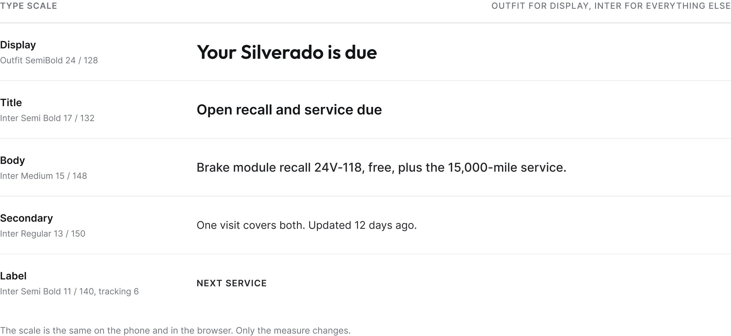
Everything on every surface resolves through a variable. This half of the system never moves: the same scale, the same greys, and the same four status colors, whichever dealership the app belongs to.
One shared type scale
The type hierarchy stays fixed across dealership themes.
Color, spacing, and radii
Shared foundations keep the product consistent while its dealership identity changes.
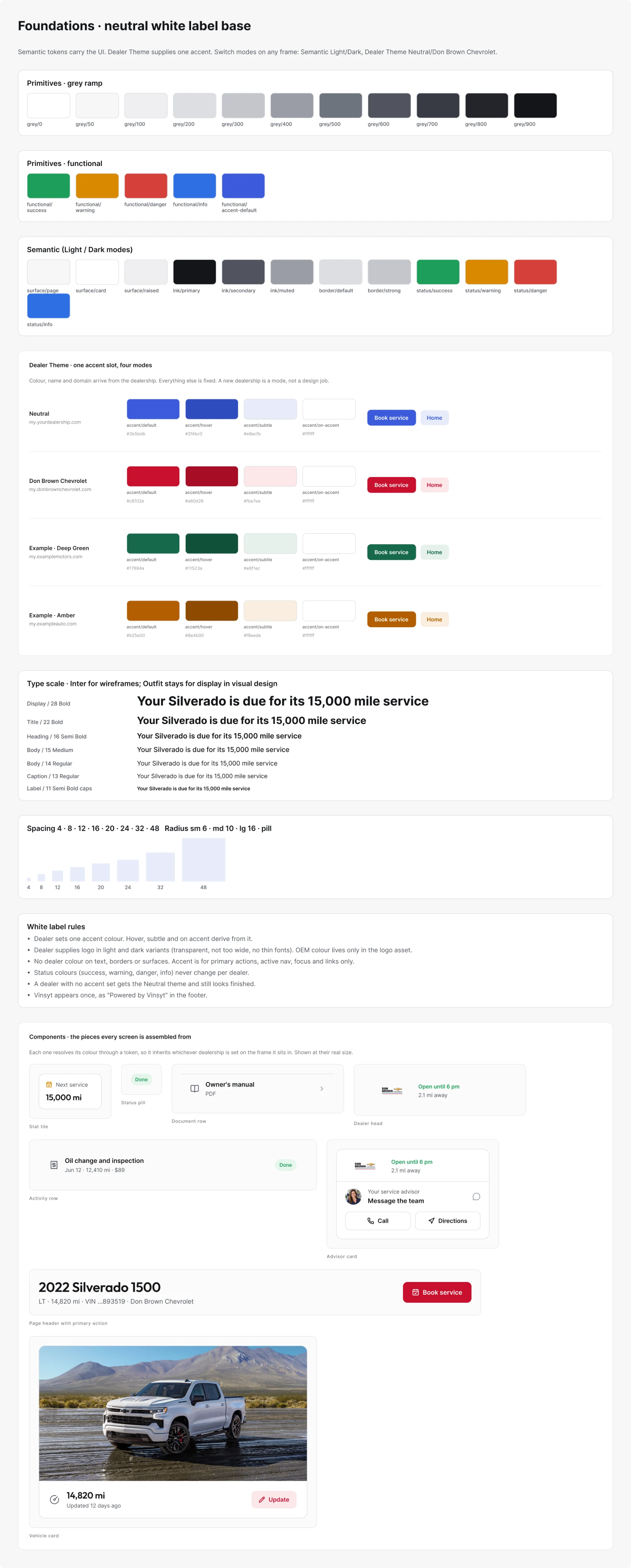
The complete reference
The full reference sheet records the values and the component patterns behind the boundary: what a dealership can change, and what stays fixed.
Scope and evidence
A production system, shown through Figma
The examples shown are Figma reference frames. Two dealership themes are configured modes, and the additional colorways illustrate how the same rules extend.
- Surfaces: two owner experiences and two messaging programs
- What varies: colour, logo, name and domain, from one input
- What stays fixed: type scale, neutrals, status colours, spacing and radii
- Implementation: I designed the system, the lead developer built the token pipeline